Introduction
I plan to rebuild my current theme into a full-site editing one and do so while live coding and live streaming.
Here’s the recap of the fifth streaming session.
Legend: ❓question, 👨🏻💻 code, ✅ check, 📖 read, 🎥 watch, 🧠 learn.
Part 1: Page Layout
- ❓How are containers managed in WordPress?
- 📖 https://make.wordpress.org/core/2021/06/29/on-layout-and-content-width-in-wordpress-5-8/
- 🧠 There are two container sizes available in WordPress (contentSize and wideSize). Declared in theme.json settings/layout
- ❓How do we choose on which layout to place our elements?
- 🧠 We can apply a layout by using the align property on each block
- full → full width
- wide → wideSize
- none (inside a contained block) → contentSize
- 🧠 We can apply a layout by using the align property on each block
- 🧠 Even if you apply those settings via the editor, it won’t work if your theme doesn’t have a theme.json file with the settings/ layout declarations.
- ❓How are styles applied when choosing a layout?
- full → adds an
alignfullclass on the element, with no associated styles on it. - wide → adds an
alignwideclass on the element, with the following associated styles :body .is-layout-constrained > .alignwide { max-width: var(--wp--style--global--wide-size);} - none → does not add a specific class on the element, but the element is concerned by those global styles :
- full → adds an
body .is-layout-constrained > :where(:not(.alignleft):not(.alignright):not(.alignfull)) {
    max-width: var(--wp--style--global--content-size);
    margin-left: auto !important;
    margin-right: auto !important;
}- ❓Is there a way to specify more sizes? Like a narrow size for example?
- Apparently no. There’s no documentation for this, and it’s also not part of the theme.json schema, meaning if your try to add a value there along contentSize and wideSize, it will be marked as invalid by your IDE.
- ❓Is there a way to change their width responsively?
- 🧠 The
--wp--style--global--content-sizeand--wp--style--global--wide-sizeare generated by the style engine based on the values in theme.json.
body {
    margin: 0;
    --wp--style--global--content-size: 960px;
    --wp--style--global--wide-size: 1280px;
}- 🧠 That means we could alter the variable depending on breakpoints to fine tune the responsive support.
- 👨🏻💻 Built layout properly on every page by creating groups (section, full width, with anchors), containing another group (wide width), containing my content.
- 👨🏻💻 Repeating the process for each section of each page.
- ✅ The layout is now fine (index, header, footer, content)
- 🧠 It would have been smarter to create block patterns for sections and containers instead of doing it manually. Might try it for next time.
Aside 1: Theme generator
- 👨🏻💻 Gathering all I’ve learned to place it inside the wonderwp block theme generator
- ✅ Now generates templates/index.html, theme.json with layout section, parts/header.html, and parts/footer.html.
- 📖 You can find the associated generator pull request on GitHub.
- ✅ The generated block theme works, can be activated and used right away and puts you on the right track to take over in the site editor from there.
Part 2: Font Sizes
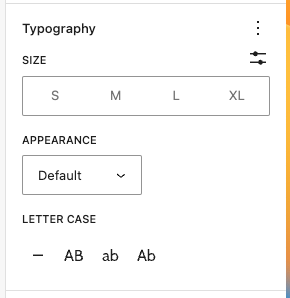
- 🧠 By default, WordPress proposes 4 sizes: S, M, L, and XL.
- 🧠 It corresponds to the following CSS variables:
--wp--preset--font-size--small: 13px;--wp--preset--font-size--medium: 20px;--wp--preset--font-size--large: 36px;--wp--preset--font-size--x-large: 42px;
- 🧠 And it looks like this in the editor:
- ❓How can we modify that to match our theme design?
- 📖 https://fullsiteediting.com/lessons/theme-json-typography-options/#h-font-size
Declaring font sizes
- 🧠 Font size settings for the website and all blocks are added to theme.json under
settings.typography.fontSizes. - 🧠 You can specify more than 4, and label them how you want, but it’s best to follow some kind of nomenclature or convention.
- 🧠 You can declare specific font sizes for specific blocks by redeclaring
"typography": { "fontSizes": []inside a block settings (settings/blocks/anyblock) - 🧠 There’s no responsive support, so if you wanted to have an h1 at 8rem on desktop and 6rem on mobile you can’t declare that with breakpoints. There’s however support for fluid typography. If you add a
"fluid": { "min": "1rem", "max": "1.75rem" }property to a font size, the style engine will generate a clamped variable. - 🧠 Once declared, WordPress changes the font sizes we can apply in the admin.
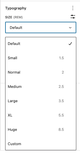
- 👨🏻💻 Updated my theme.json with my font sizes.
- ✅ The admin now proposes my custom font sizes.
Using font sizes
- 🧠 You can apply a font size via the editor.
- When applying a font size on an element, WordPress will add a specific size class on them:
has-slug-font-size, exhas-medium-font-size. - This class then holds the size style property e.g.:
.has-medium-font-size { font-size: var(--wp--preset--font-size--medium) !important;}
- When applying a font size on an element, WordPress will add a specific size class on them:
- 🧠 You can apply a font size via the theme.json file.
- you can use the generated CSS variables to apply a font size via theme.json on any block
- ex:
"blocks": { "core/post-author": { "typography": { "fontSize": "var(--wp--preset--font-size--small)" } },
- 🧠 You can apply a font size via the style engine.
- The style engine generates CSS variables for each font size, we can then use them in our theme.json style declarations or our CSS files.
- e.g. in theme.json:
"styles": { "typography": { "fontSize": "var(--wp--preset--font-size--medium)" } } - e.g. in CSS:
.my-class { font-size: var(--wp--preset--font-size--medium) }
Part 3: Spacings (margin & paddings)
- 🧠 Unlike font sizes, there’s no spacing support by default
- ❓How can we declare margins and paddings?
Declaring spacings
- 📖 https://fullsiteediting.com/lessons/theme-json-layout-and-spacing-options/#h-margin-and-padding
- 📖 https://developer.wordpress.org/themes/advanced-topics/theme-json/#spacing
- 📖 https://developer.wordpress.org/block-editor/reference-guides/theme-json-reference/theme-json-living/#appearancetools
- 🧠 Margin and padding settings are disabled by default.
- 🧠 you can enable them either by declaring appearance tools to true, or
"spacing": { "margin": true, "padding": true }in settings/spacing in theme.json. - 🧠 There are seven steps in the default scale (in addition to the first step, 0), and each step multiplies the value by 1.5. Each value is assigned to a CSS custom property (–wp–preset–spacing–20 to –wp–preset–spacing–80) by default.
- 🧠 You can declare an automatic spacing scale by declaring a base value and unit, like 1.5rem, then say you want 6 other values from that base with a 1.5 multiplier.
- 🧠 You can declare spacing presets manually, without an automatic scale. If your scale is non-linear, then that’s the way to go.
- 🧠 Spacing scales are not responsive according to some breakpoints. There’s currently no way to tell an XL spacing to be 8rem in after 1200px wide and 6rem on another specific breakpoint. If you want to have some sort of responsive behaviors, you can use clamped values. Unlike font sizes though, there’s no min/max attribute support, so you’ll have to calculate the clamps yourself.
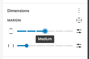
- 👨🏻💻 Updated my theme.json with my spacing scale.
- ✅ The admin now proposes my custom spacing scale.
Using spacings
- 🧠 You can apply margins and paddings via the editor
- When applying a margin or padding on an element, WordPress will add the corresponding inline style to it, e.g.:
margin-top: var(--wp--preset--spacing--60);
- When applying a margin or padding on an element, WordPress will add the corresponding inline style to it, e.g.:
- 🧠 You can use the generated CSS variables to apply a font size via theme.json on any block.
"styles": { "blocks": { "core/post-title": { "spacing": { "margin": { "bottom": "var(--wp--preset--spacing--50)", "top": "var(--wp--preset--spacing--30)" } }} } }
- 🧠 You can use the generated CSS variables to apply a font size inside your CSS or SCSS files.
.my-class { margin-top: var(--wp--preset--spacing--50) }
Current theme.json file
{
  "version": 2,
  "$schema": "https://schemas.wp.org/trunk/theme.json",
  "settings": {
    "color": {
      "palette": [
        {
          "color": "#f7f7f7",
          "slug": "light",
          "name": "Light"
        },
        {
          "color": "#3a3a3a",
          "slug": "dark",
          "name": "Dark"
        }
      ]
    },
    "typography": {
      "fontFamilies": [
        {
          "fontFamily": "\"itc-avant-garde-gothic-pro\", Arial, sans-serif",
          "name": "itc-avant-garde",
          "slug": "itc-avant-garde",
          "fontFace": [
            {
              "fontFamily": "itc-avant-garde-gothic-pro",
              "fontDisplay": "auto",
              "fontStyle": "normal",
              "fontWeight": "700",
              "src": [
                "file:./assets/fonts/itc-avant-garde-bold.woff2"
              ]
            },
            {
              "fontFamily": "itc-avant-garde-gothic-pro",
              "fontDisplay": "auto",
              "fontStyle": "normal",
              "fontWeight": "300",
              "src": [
                "file:./assets/fonts/itc-avant-garde.woff2"
              ]
            }
          ]
        }
      ],
      "fontSizes": [
        {
          "slug": "small",
          "size": "1.5rem",
          "name": "Small"
        },
        {
          "slug": "normal",
          "size": "2rem",
          "name": "Normal"
        },
        {
          "slug": "medium",
          "size": "2.5rem",
          "name": "Medium"
        },
        {
          "slug": "large",
          "size": "3.5rem",
          "name": "Large"
        },
        {
          "slug": "x-large",
          "size": "5.5rem",
          "name": "XL"
        },
        {
          "slug": "huge",
          "size": "8.5rem",
          "name": "Huge"
        }
      ]
    },
    "layout": {
      "contentSize": "960px",
      "wideSize": "1280px"
    },
    "spacing": {
      "margin": true,
      "padding": true,
      "spacingSizes": [
        {
          "slug": "30",
          "size": ".5rem",
          "name": "Tiny"
        },
        {
          "slug": "40",
          "size": "1rem",
          "name": "Small"
        },
        {
          "slug": "50",
          "size": "2rem",
          "name": "Medium"
        },
        {
          "slug": "60",
          "size": "4rem",
          "name": "Large"
        },
        {
          "slug": "70",
          "size": "8rem",
          "name": "XL"
        },
        {
          "slug": "80",
          "size": "16rem",
          "name": "2XL"
        }
      ]
    }
  },
  "styles": {
    "color": {
      "background": "var(--wp--preset--color--light)",
      "text": "var(--wp--preset--color--dark)"
    },
    "typography": {
      "fontFamily": "var(--wp--preset--font-family--itc-avant-garde)"
    }
  }
}
See the associated pull request to watch the theme.json changes.
Current website look
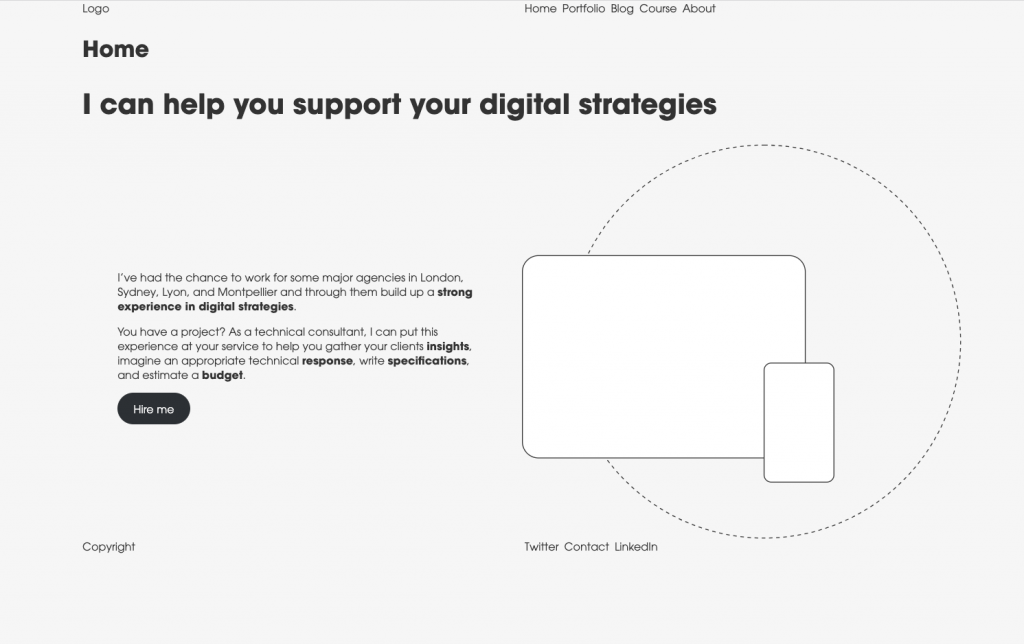
I’ve started putting in some content. Everything is aligned on either contentSize or wideSize now. I’ll need to work on the media & text block padding that looks off though.
I’ve converted my logo to a pattern to see how to use dynamic patterns in there (same for copyright). Not quite happy with that just yet. Might need to convert it to a block instead.
I’ve removed the nav style for now and will rework that later and decide if I should apply theme styles via the editor, via CSS or via theme.json
Plan for next time
- 👨🏻💻 Use the global styles interface to style simple elements and see if I can integrate that in my theme.json
If you found this article interesting, I encourage you to follow my work via the form below. I mainly write about production teams' optimization, processes, management, and the tooling around those subjects. I’m even preparing an online course to concentrate all of this for you in a unique place. I hope it can help you get the very best out of your development team.
Follow my work
Follow me to get notified of new posts, resources, and online courses I create.